Intelligent Alerts for Enterprise Investors
Transforming a single passive notification into a proactive, configurable monitoring system.
Role
Product Designer
Timeline
August - October 2024
Scope
0 → 1
Domain
Enterprise SaaS, Notification Systems , AI-Assisted UX
Due to NDA, certain details, data, and visuals have been simplified or abstracted to respect confidentiality. The case study focuses on design process and decision-making.

# Overview
At a Glance
A smart alerting system for a large enterprise financial data platform serving institutional investors - portfolio managers, analysts, and asset owners who need to know the moment something in their portfolio moves, not the next time they happen to check a dashboard.
These Institutional users needed to moved users from compulsively checking the dashboard to trusting the system to tell them when something mattered. This case study walks through how that shift got designed - and what's still left to prove.
My role: Research synthesis, interaction design, AI behavior design, engineering handoff documentation.
Collaborative input: A senior designer (visual QA), two PMs (scope grounding + stakeholder validation), one engineer (feasibility checks).
# Context
Users were flying blind between dashboard visits
On a platform serving portfolio managers, analysts, and asset owners, the notification system did one thing: confirm report downloads. No custom thresholds, no proactive signals, no delivery preferences.
Two PMs confirmed the pattern: Users ran repeated manual dashboard checks as a substitute for alerts that didn't exist. The opportunity wasn't to improve notifications - it was to build a monitoring system from scratch.
01
Reactive only
Notifications were limited to system events. No user-defined alerts, no threshold monitoring.
02
No personalization
Users couldn't customize alert conditions, delivery channels, or frequency.
03
Fragmented experience
No centralized space to manage alerts or track notification history.
04
Data-signal gap
The platform held valuable data. Users had no way to be proactively notified when it mattered.
THE REALITY
Notifications only for report downloads
Manual dashboard checks for updates
No custom alert thresholds
In-app only, no email delivery
No notification history or audit trail
WHAT’S NEEDED
Configurable alerts on any monitored entity
Proactive signals surfaced to users
Threshold, condition & AI-based triggers
Multi-channel: in-app + email delivery
Centralized history with compliance logging
# The Approach
Two decisions did most of the work
Before any screen got built, two structural bets shaped everything downstream, how alerts get created, and how urgency gets shown to the user. Neither was obvious at the start, and both went through several rounds of stakeholder feedback before landing where they did. Here's the research that shaped them, and the trade-offs behind each one.
# Research
Understanding the landscape
With no direct access to end users, research relied on two inputs: internal stakeholder interviews and a competitive audit. Two PMs with direct client-team exposure were interviewed about the problem space and user needs.
Their input surfaced the core pattern - frequent manual dashboard checks driven by anxiety about missing market movements - and clarified that different user types had fundamentally different monitoring needs …
Alerts ≠ Notifications
Alerts are user-configured and urgent; notifications are informational and system-generated. Leading platforms keep them distinct - this one collapsed both into a single confirmation.
Actionable & manageable
Awareness without action is incomplete - users need to filter, mark read, and track alerts over time. Bloomberg and fintech SaaS platforms confirmed this consistently.
Monitoring gap
The platform supported task updates, not continuous monitoring - users tracking market signals needed a configurable system, not an event log.
The Core Insight
Notifications needed to evolve from event-based updates to a configurable system - one where users define what they track, how they're alerted, and when. That meant redesigning the notification model itself, not adding alert types on top of it.
# Key Design Decisions
The trade-offs that shaped the system
Two decisions defined the system. Everything else followed from them. Both went through several rounds of stakeholder feedback before landing here - what's crossed out below wasn't hypothetical, it's what was actually on the table first.
One notification creation flow or two?
Single 5-step wizard for all users
→
Dual-path modal - AI-assisted or manual, converging at the same review screen
A single wizard would have degraded either speed or control. The dual path served both user types without compromise.
How to handle urgency?
Flat list — all alerts treated equally
→
Three-tier visual hierarchy with color-coded left borders
A 2% index drop and a report download need very different treatment. Color makes scanning instant without reading every item.
The tier hierarchy in detail:
Tier 1 - Critical Smart Alert
User-defined threshold breached - e.g., index crossed ±2%
Two additional decisions shaped the system:
Placing alert management within Settings (not a new nav item) to extend a familiar pattern.
Surfacing alert creation contextually on entity pages - "Set Alert on This Portfolio" - for better discoverability at the point of intent.
# Solution
Three surfaces, one system
Rather than a single monolithic page, the system was structured as three interconnected surfaces - each optimized for a different user intent.
Given a compliance-sensitive, enterprise-financial audience, contrast and keyboard navigation were kept in mind throughout - though a full accessibility audit hasn't happened yet and is part of the pre-scale validation work covered below.
Due to NDA constraints, the actual production screens cannot be shared. These were recreated for the purpose of this case study using AI-assisted design, reflecting the same design decisions and workflows.

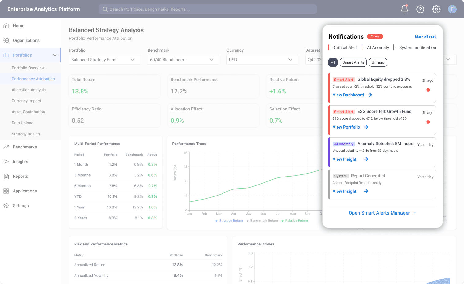
1
On designing for complexity
A lightweight triage layer from the bell icon. Redesigned with timestamps, priority hierarchy, and type badges - critical alerts, AI anomalies, and system events distinguishable at a glance.
2
Notification Centre
The management hub in three tabs: Smart Alerts (create, manage, filter), Preferences (delivery settings), and History (searchable audit trail). AI Suggestions surface monitoring gaps proactively - recommending unconfigured alerts based on holdings and peer behavior.

3
Alert Creation - Dual Path
Two paths converge at the same review step. AI-assisted: describe in plain language, AI configures. Manual: 5-step wizard with full control. A duplicate check at review would prevent conflicting alerts and keeps the system clean at scale.

4
Alert Detail View
When an alert fires, users need context - not just a notification. The detail view shows a 30-day trend with the trigger point marked, correlated alerts, configuration summary, and on-demand AI insight generation. Three quick actions minimize the distance between signal and decision.
# AI-Forward Design
Intelligence at every layer
AI wasn't added as a single feature bolted onto an existing flow - it shows up at three distinct moments: before (suggesting what to monitor), during (simplifying creation), and after (explaining why an alert fired). Each moment has a different job, and a different amount of user trust to earn.
AI-Assisted Creation
Describe what to monitor in plain language, and AI pre-fills the configuration - 5 steps become 1. It still lands on the same editable review, so a misread intent gets caught before it goes live.
Anomaly Detection
The system flags unusual patterns - a 2.4σ volatility spike - without requiring explicit user-defined thresholds. Surfaced as a distinct "AI Anomaly" alert tier to maintain trust.
Proactive Suggestions
AI recommends unconfigured alerts based on holdings and peer behavior. Appears in the Notification Centre and contextually on entity pages - surfacing gaps users don't know they have.
AI features are clearly distinguished from user-configured alerts at every touchpoint - separate visual tiers, distinct badges, explicit labeling. The system augments judgment, never replaces it.
# Outcomes
Complete by Design. Ready for What's Next
This project reached full completion - research, design, and engineering handoff - with complete stakeholder alignment across product and engineering. As platform priorities evolved, the system's rollout timeline shifted, but the design itself stands ready: fully specified, technically validated, and built to scale without rework.
Handoff Complete
Complete design system - Three interconnected surfaces, dual creation flow, AI integration, edge cases, and full interaction specs.
Cross-functional alignment achieved - Signed off by 2 PMs, 1 engineer, and the broader product team with zero scope disputes at handoff.
Engineering-ready from day one - Handoff required no scope clarification, a rare outcome for a 0→1 system.
Built to scale - Alert categories, entity taxonomy, and delivery channels architected to extend without rework as the platform grows.
Efficiency gain - Reduced alert creation from a mandatory 5-step flow to a 1-step AI-assisted path for common cases, while preserving full manual control for complex configurations
# What's next
Validate before scaling
With the design fully specified and engineering-aligned, the natural next step is usability testing with portfolio managers to validate the dual creation flow and alert taxonomy, alongside a formal accessibility audit for the compliance-sensitive audience - both scoped and ready to run whenever this returns to the roadmap.
# Reflections
What this project is teaching me …